
Introduction
A word tattoo is one of the most personal decisions a person can make. Unlike purely visual artwork, a word or phrase carries meaning that is immediate, direct, and undeniable. When someone reads a tattoo on your wrist, your collarbone, or your spine, there is no ambiguity about what it means to you. That directness is precisely what makes word tattoos so compelling and so enduring as a form of self-expression.
But the text itself is only half the equation. Word tattoo placement is the other half, and it is a decision that shapes everything about how your tattoo looks, feels, functions, and lasts over the years. The same single word tattooed in the same font will read completely differently depending on where it sits on your body. Placed on the inner wrist, it becomes a quiet personal reminder. Placed down the spine, it becomes a powerful, almost architectural statement. Placed behind the ear, it becomes a whispered secret meant only for those who are close enough to notice.
This guide covers 18 of the best word tattoo placement ideas, examining each location through the lens of aesthetics, pain, visibility, longevity, and the kind of meaning each placement tends to carry. Whether you are drawn to something bold and visible or something intimate and private, there is a placement on this list that is right for your words and your life.
Before exploring the individual placements, it is worth understanding that font style and placement are deeply connected. Script and cursive lettering flourish in narrow, flowing areas like the wrist, forearm, and spine because the curves of the letterforms echo the natural lines of the body. Block and print fonts work better in broader, flatter areas like the back, thigh, and chest where there is space for the clean, deliberate geometry of the letters to breathe. Keeping this relationship in mind as you read through these placements will help you develop a clearer vision of what will work for your specific idea.
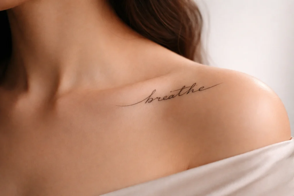
The Inner Wrist
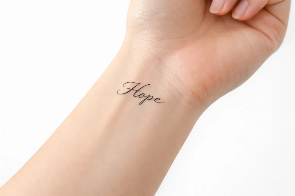
The inner wrist is one of the most classic and beloved placements for word tattoos, and it has maintained that status for a very good reason. It sits in a location that is visible to the wearer throughout the day, creating an almost meditative quality for tattoos that carry motivational, spiritual, or deeply personal meaning. Single words like “breathe,” “faith,” “hope,” or “strength” sit beautifully here, as do short dates rendered in Roman numerals and brief phrases that function as personal mantras.
The inner wrist has a naturally narrow horizontal canvas, making it ideal for one to three words in a clean, legible font. Script lettering works particularly well in this location. Pain is moderate due to the thin skin and proximity to veins, but the small scale of most wrist tattoos means sessions are short and very manageable. One practical advantage is that a watch or bracelet can cover this tattoo completely when needed.
The Forearm
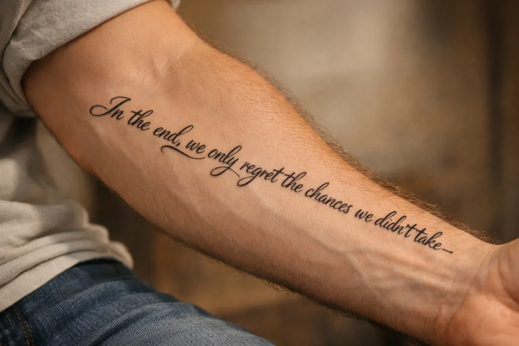
The forearm is one of the most versatile and frequently chosen locations for word tattoo placement because it offers a generous, relatively flat surface that accommodates everything from a single word to a full quote of several lines. The outer forearm is highly visible and works well for tattoos that the wearer wants to display with confidence. The inner forearm is slightly softer in character and tends to be chosen for more personal content.
Script tattoos run beautifully along the length of the inner forearm, following the natural line of the arm from elbow to wrist. The forearm also works well for horizontal text in block fonts, particularly on the outer surface. This is a practical everyday placement for anyone who wants their words to serve as a visible reminder, and it is one of the least painful locations available, making it a strong starting point for those getting their first word tattoo.
The Collarbone
The collarbone is one of the most elegant and feminine placements for word tattoos, though it works beautifully on any person who wants a placement that combines subtle visibility with natural grace. Words or short phrases tattooed along the collarbone follow the gentle curve of the bone itself, creating a natural sense of flow that purely straight placements cannot replicate.
This area is particularly well suited to script lettering in a delicate font, where the cursive letterforms complement the soft arc of the collarbone. Meaningful names, a short phrase, or a single powerful word all translate well here. Pain is moderate to notable in this area due to the proximity to the clavicle bone, but the relatively small size of most collarbone word tattoos keeps sessions short. The placement is easily revealed with a low neckline and easily concealed with a collar.
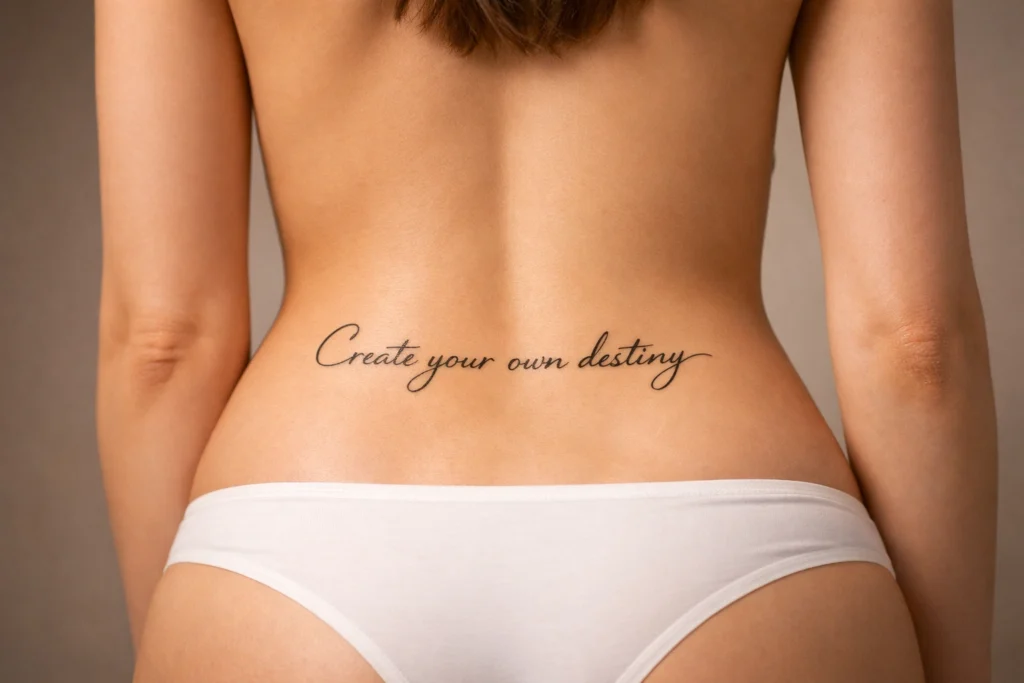
The Spine
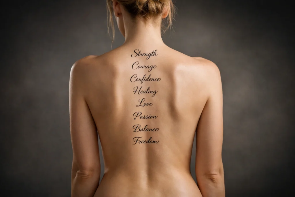
A vertical column of words running down the spine is one of the most striking examples of word tattoo placement anywhere on the body. The spine provides a long, narrow, perfectly centered line that suits longer quotes, song lyrics, or a series of meaningful words stacked one on top of another. The architectural quality of this placement gives the text an almost monumental presence when the back is revealed.
This placement is deeply personal by nature since it is not visible to the wearer without a mirror, and it is primarily hidden in most everyday contexts. People who choose spine tattoos tend to be motivated by the meaning of the words rather than the desire for constant display. The spine is among the more painful tattoo locations due to the proximity of the needle to the vertebrae, but for the right person with the right words, the result is extraordinary.
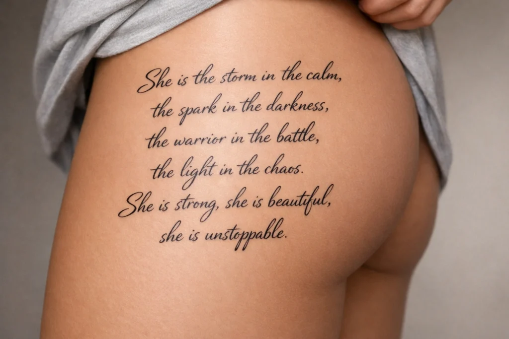
The Ribcage
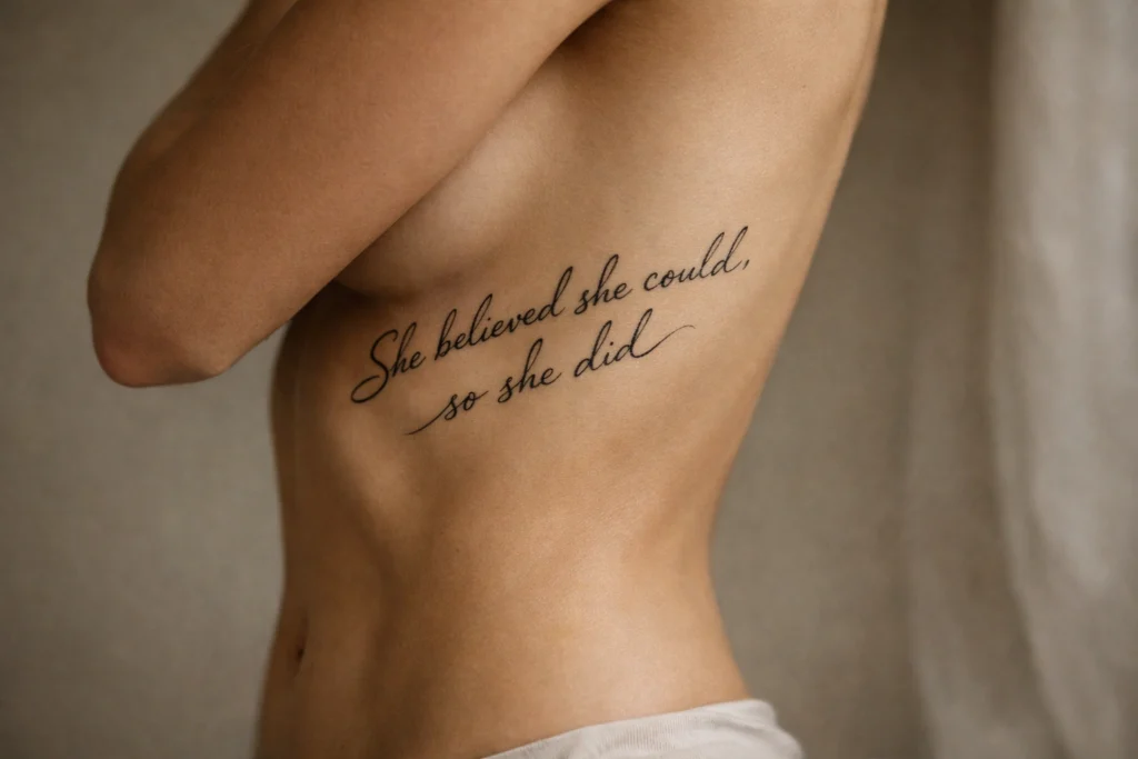
Rib tattoos for word placements carry a particular emotional weight that few other locations can match. Positioned close to the heart and typically hidden from view, words tattooed along the ribcage feel like a private declaration, something the wearer carries with them always but shares only with those they choose to let in.
Longer quotes, meaningful phrases, and lines of poetry all work well in this space because the ribcage provides a generous vertical or diagonal canvas. Script lettering in a flowing, slightly elongated style is the most common font choice for this location. The honest reality is that the ribs are one of the more challenging tattoo placements in terms of pain, as the skin is thin and sits directly over bone. That intensity, for many people, only deepens the meaning and significance of what they chose to put there.
The Upper Back and Shoulder Blades
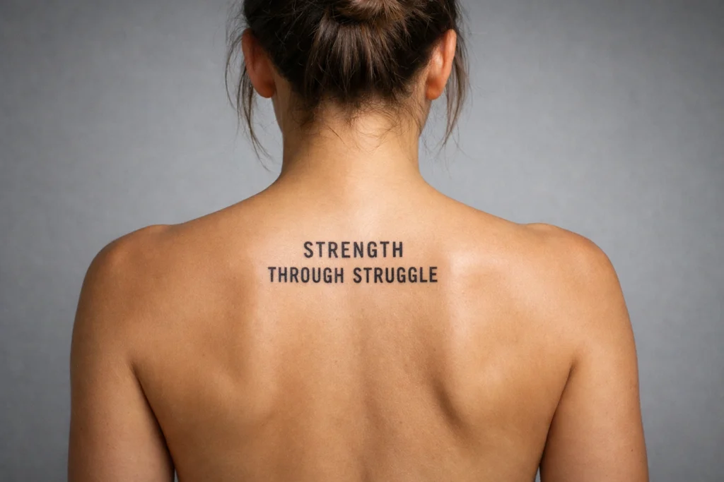
The upper back, particularly the area spanning between the shoulder blades, is a natural canvas for word tattoos that are meant to be seen when a person’s back is turned. A meaningful name, a two or three word phrase, or a short quote stretches beautifully across this width, and the relatively flat, broad surface provides excellent clarity for both script and block lettering.
This placement is easily concealed under most clothing and revealed with a backless top or open collar. Pain levels are moderate across most of the upper back, with some increase near the shoulder blades where the skin sits closer to bone. The upper back has good skin stability, meaning tattoos in this area tend to hold their detail and definition well over time.
The Chest

The chest has long been associated with deeply meaningful tattoos because of its proximity to the heart. For word tattoos specifically, the chest provides a broad, relatively flat area that works well for single words, short phrases, or names that carry profound personal significance. A centered chest placement directly over the sternum is particularly powerful, while a placement on one side of the pectoral creates a more asymmetric, personal feel.
Block and print fonts tend to read especially clearly on the chest given the available space, though elegant script can work beautifully here as well for smaller, more intimate text. Pain levels vary across the chest, with the outer pectoral area being more comfortable and the area near the sternum being more challenging. For men and women alike, the chest is among the most emotionally resonant placements for words that carry life-defining importance.
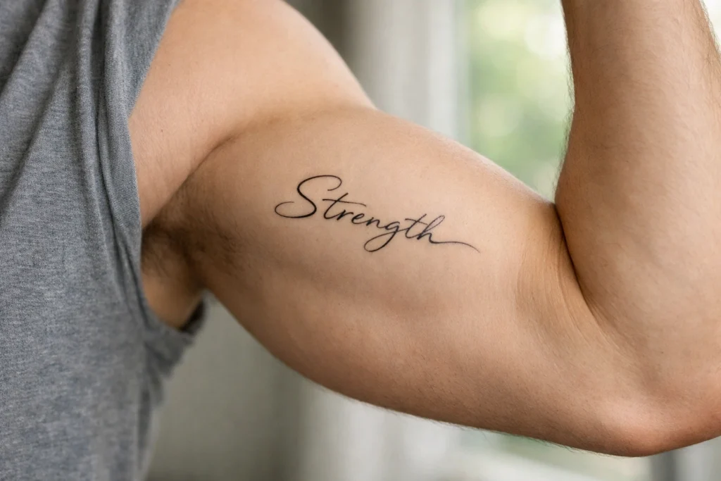
The Upper Arm and Bicep
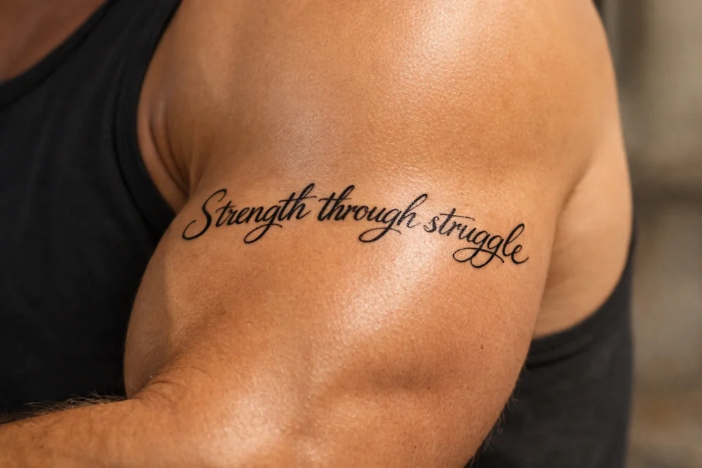
The upper arm and bicep offer one of the most comfortable and practical locations for word tattoo placement. The outer bicep is particularly suited to short horizontal phrases or single words, and the curved surface of the muscle creates a natural framing effect that makes well-placed text look intentional and strong.
Script lettering wraps naturally around the upper arm, and this placement is also conducive to text that will eventually integrate into a larger sleeve design. For anyone planning long-term body art that builds toward a full or half sleeve, placing a meaningful word or phrase on the upper arm early is a smart way to anchor a future composition. Pain levels here are among the lowest of any placement, making this a practical choice for almost any person.
The Neck
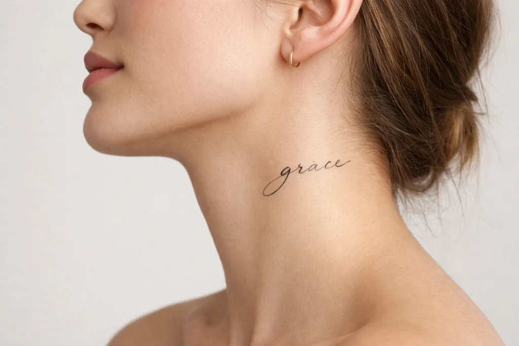
The neck occupies a unique position in the world of word tattoo placement because it sits at the intersection of deeply personal and publicly visible. A word tattooed on the side of the neck is seen by virtually everyone the wearer encounters in face-to-face interaction, and that visibility demands a confident relationship with both the content of the tattoo and the social contexts in which it will appear.
The back of the neck is slightly less prominent and more intimate than the side. Single words, initials, short names, and minimal script all work well in the limited space that neck placements provide. Pain is notable here due to thin skin and sensitive nerve endings. For anyone in a professional environment with strict dress codes, neck placement requires careful consideration of long-term career implications.
Behind the Ear
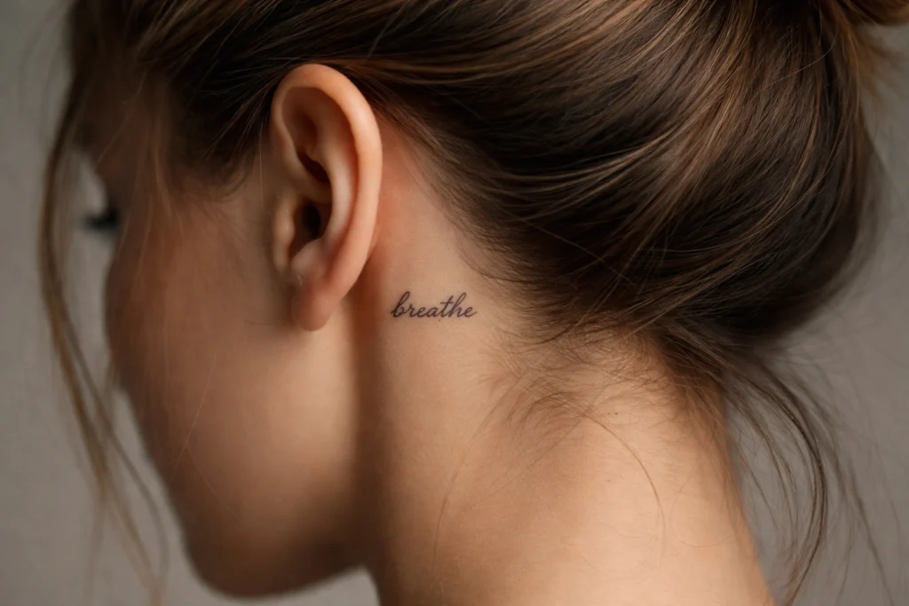
The space directly behind the ear is one of the most discreet and intimate word tattoo placements available. Small, delicate text in this location carries a whispering quality, something seen only by those who are close enough and observant enough to notice. Single words, small initials, and minimal script in a fine font are the designs that work best here given the limited surface area.
This placement is particularly popular among people who want word tattoos that feel private rather than declarative. The pain level behind the ear is notable given the thin skin and proximity to cartilage, but the small size of tattoos in this location keeps sessions brief. Hair can cover this placement completely when desired, giving the wearer total control over when it is on display.
The Shoulder
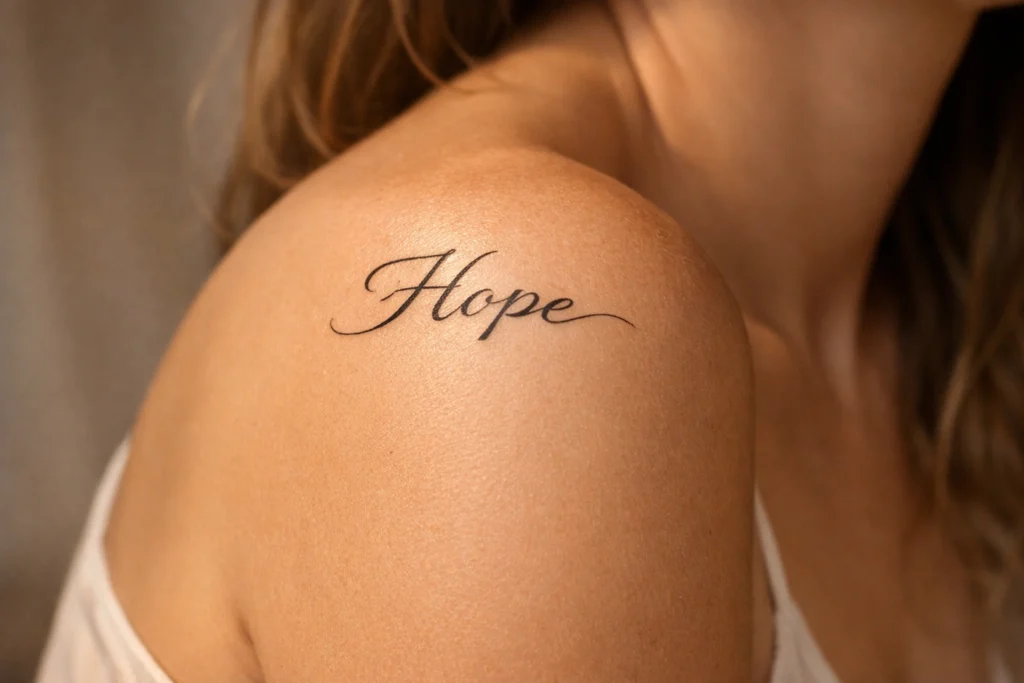
The shoulder provides a rounded, slightly contoured surface that works naturally with word tattoos that benefit from a gentle curve in their composition. A word or phrase that arcs slightly across the front of the shoulder or sits flat across the outer shoulder both produce very different but equally appealing effects. This placement has traditional roots in many tattooing cultures where single words denoting strength, loyalty, or identity were commonly placed on the shoulders.
The shoulder is one of the more comfortable areas to get tattooed, which is an advantage when spending extended time in the chair for longer text. It is also a transitional location that connects naturally to both the upper arm and the chest, making it a useful placement for anyone building toward a larger composition over time.
The Thigh
The outer thigh is one of the most underappreciated placements for word tattoos, and it deserves considerably more attention than it typically receives. It offers one of the largest available canvases on the body, is virtually hidden in professional settings, and is among the least painful locations for tattooing due to the generous muscle and fat tissue that separates the skin from bone.
For longer quotes, complete song lyrics, lines from literature, or any text that requires space to unfold properly, the outer thigh is extraordinary. Text can run horizontally across the thigh in multiple lines, or a longer single line can flow from hip to knee in a flowing script. The thigh is also one of the more age-resistant placements in terms of skin stability, meaning the text tends to hold its shape and readability well over the years.
The Ankle
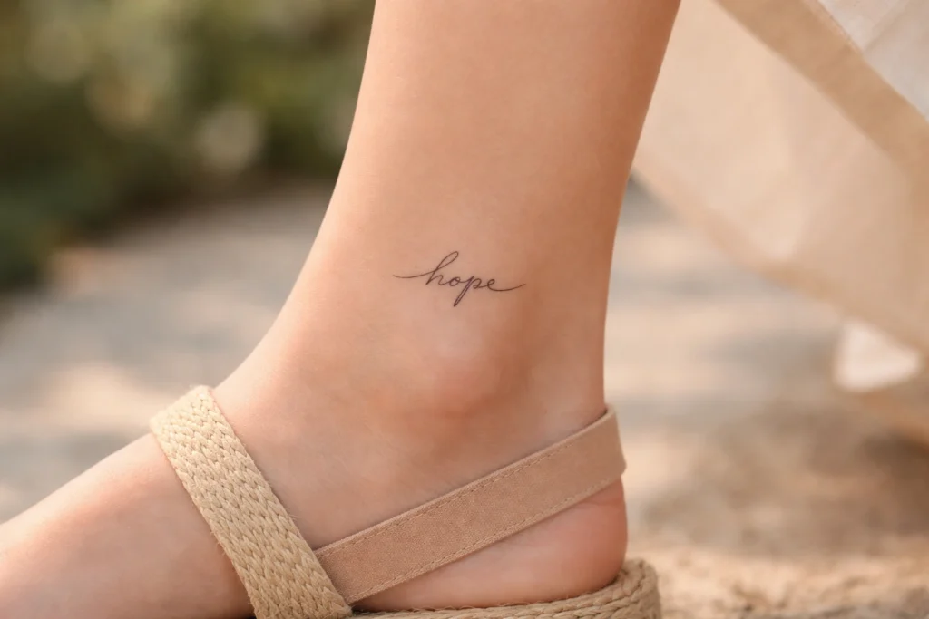
The ankle is a compact, stylish placement for word tattoos that carries a light and personal energy. Small words, meaningful dates, initials, and short phrases work best in this space given the relatively limited surface area around the ankle bone. Script lettering that follows the natural curve of the ankle creates a jewelry-like quality that many people find particularly attractive in this location.
The ankle is on the more painful end of the placement spectrum due to the thin skin over the bone, and tattoos here may require more frequent touch-ups than other locations because of their exposure to friction from footwear and sun exposure. That said, for a person who wants something minimal, personal, and quietly visible when wearing sandals or shorts, the ankle is an excellent choice.
The Finger
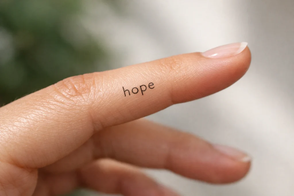
Finger tattoos for words occupy the very minimal end of the spectrum. A single letter, a short initial, a small Roman numeral, or a one-syllable word can sit elegantly on the side or top of a finger. These tattoos have a bold, distinctive quality and are particularly popular as matching tattoos for couples or close friends who share a word of significance between them.
The practical challenge with finger tattoos is longevity. Because fingers are in constant use, exposed to water repeatedly throughout the day, and frequently in contact with surfaces, the ink in finger tattoos tends to fade faster than any other placement. Touch-ups are an expected part of maintaining finger word tattoos, and anyone choosing this placement should factor that maintenance into their decision.
The Foot
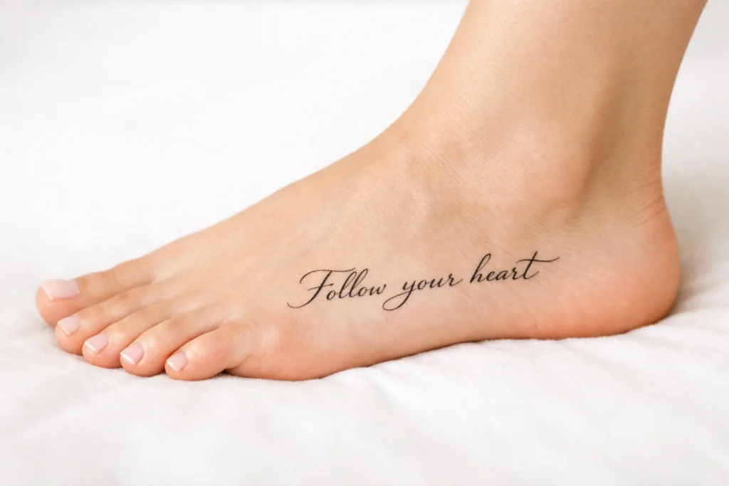
The lateral side of the foot provides a natural flowing line that suits word tattoos with a horizontal or slightly angled orientation. A word or short phrase along the side of the foot has a grounded, subtle quality that appeals to people who want something visible only in specific contexts, such as at the beach or during warm weather when sandals are worn.
The foot is a challenging placement in terms of both pain and longevity. Thin skin over the bones of the foot makes tattooing more uncomfortable, and constant exposure to friction from shoes, socks, and the ground causes foot tattoos to fade more rapidly than those on protected areas of the body. Careful aftercare and periodic touch-ups are important considerations for anyone choosing this location.
The Lower Back
The lower back has evolved considerably as a placement choice over the past two decades. When approached thoughtfully with genuinely meaningful text, the lower back offers a wide, relatively flat canvas that suits horizontal phrases or a cluster of meaningful words presented as a unified composition. The placement is very easily concealed and only revealed by choice, giving the wearer complete control over its visibility.
Script lettering that follows a gentle arc across the lower back is a particularly effective design approach for this location. The natural slight curvature of the lower back means that text benefits from being written with a subtle corresponding curve rather than in a perfectly straight horizontal line, which artists with experience in word tattoos will account for in the design process.
The Hip

The hip is a deeply personal and intimate word tattoo placement that suits people who want meaningful text in a location that is almost entirely private. Words or short phrases placed along the hip bone or on the hip itself have an organic, body-following quality because the natural contours of the hip create movement in even a simply placed text tattoo.
This placement is well suited to fine script lettering that flows naturally with the shape of the body rather than cutting across it geometrically. Pain levels near the hip bone can be notable, but the upper hip area further from the bone is more manageable. For anyone who wants a deeply personal word tattoo that feels like something truly their own rather than a public display, the hip is one of the most meaningful choices available.
The Inner Bicep
The inner bicep is an often overlooked gem in the world of word tattoo placement. It sits in a location that is naturally hidden when the arm rests at the side but revealed immediately when the arm is raised or extended, creating a relationship between the wearer and the viewer that feels intentional and slightly theatrical. For words that carry private meaning but that the person occasionally wants to share, this placement creates a natural and meaningful reveal.
Script lettering runs elegantly along the length of the inner bicep, and the slightly concave surface of this area gives the text a natural gentle arc that block fonts cannot replicate as gracefully. Pain is somewhat increased compared to the outer bicep due to the thinner skin and higher concentration of nerve endings on the inner arm, but it remains well within the range of what most people find manageable for the scale of text typically placed here.
Choosing the Right Word Tattoo Placement for You
With eighteen placement options laid out, the path to a decision requires honest self-reflection about several key factors. Your lifestyle and profession matter enormously. If you work in an environment where visible tattoos create professional friction, placements like the thigh, ribs, spine, and hip give you large, expressive canvases that remain completely private when dressed. If visibility is not a concern, the forearm, collarbone, and neck all offer daily connection to your words in a way that more hidden placements simply cannot provide.
The length of your text matters too. A single word needs a fundamentally different placement than a full quote. Single words thrive in compact placements like the wrist, behind the ear, or the finger. Longer quotes need the generous canvas of the thigh, back, or ribcage to breathe properly and remain legible as the text unfolds. Matching the scale of your text to the scale of your placement is one of the most important decisions you will make in the entire process, and it is one that a skilled tattoo artist can help you navigate with precision.
Conclusion
Word tattoo placement is not a secondary decision. It is central to whether a text tattoo succeeds as a piece of art and as a personal statement. The 18 placements covered in this guide each carry their own visual logic, their own emotional register, and their own practical realities around pain, visibility, and longevity.
The most important thing you can do before finalizing your placement is to sit with your options long enough to understand which location genuinely resonates with the meaning of your words. A motivational word that you want to see every morning belongs somewhere visible to you. A private tribute meant only for yourself belongs somewhere intimate. Words that tell the world who you are belong somewhere that the world can read.
Find the placement where your words feel at home, consult with an artist who specializes in lettering and script, and trust the process. When placement and meaning align perfectly, a word tattoo becomes one of the most powerful things a person can wear on their body permanently.
You may also like this post: The Ultimate Guide to 16 Tattoo Placement Ideas for Men
Frequently Asked Questions
What is the best placement for a word tattoo?
The best placement depends entirely on the length of your text and your visibility preferences. Short words work beautifully on the wrist, inner bicep, or behind the ear. Longer quotes and phrases need more canvas and are best suited to the forearm, thigh, spine, or ribcage.
Which word tattoo placement hurts the least?
The outer forearm, outer bicep, and outer thigh are consistently ranked among the least painful placements for word tattoos. These areas have sufficient muscle and fat to cushion the skin away from bone, which significantly reduces discomfort during the session.
What font style works best for word tattoos?
Script and cursive fonts work best in narrow, flowing placements like the wrist, spine, collarbone, and forearm. Block and print fonts read more clearly in broader placements like the back, chest, and thigh where the geometric structure of the letters has space to be appreciated.
Do word tattoos age well? Word tattoos age best in stable, protected placements like the upper arm, back, thigh, and chest. Placements that experience high friction, constant movement, or regular sun exposure, such as the hands, fingers, feet, and wrists, tend to fade and blur more quickly and may require more frequent touch-ups.
How do I decide between a visible and hidden word tattoo placement?
Consider both your professional environment and your personal relationship with the words. If the text is a private mantra or tribute, a hidden placement like the ribs, hip, or spine may feel more authentic. If the words are a statement you want to share with the world or see yourself daily, a visible placement like the forearm, wrist, or collarbone will serve that intention better.